Building a design system for FOCA
Macro is a design system that provides a library of styles, components, and patterns that are used across the FOCA ecosystem, including FOCA Stock, FOCA Editor, and the internal FOCA Dashboard tool.
Goals
- Develop a single source of truth for styles, components, and patterns that can be applied across FOCA
- Reduce the time needed to launch an experiment, test new product strategies, and landing pages with the use of a reusable component system
- Unify FOCA Stock, FOCA Editor, internal tools, and future products under a single design and component structure
Foundations
The core of Macro is the foundational and atomic elements
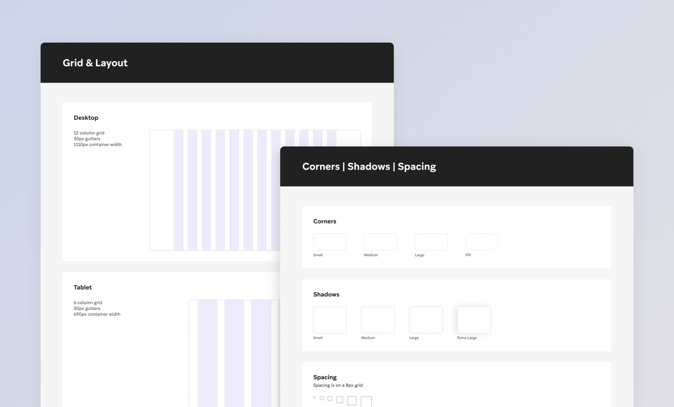
Grids & Spacing
The underlying grid is responsive and the columns collapse between different devices– it scales from large desktop screens, to laptops, and to smaller screens on tablets and phones.
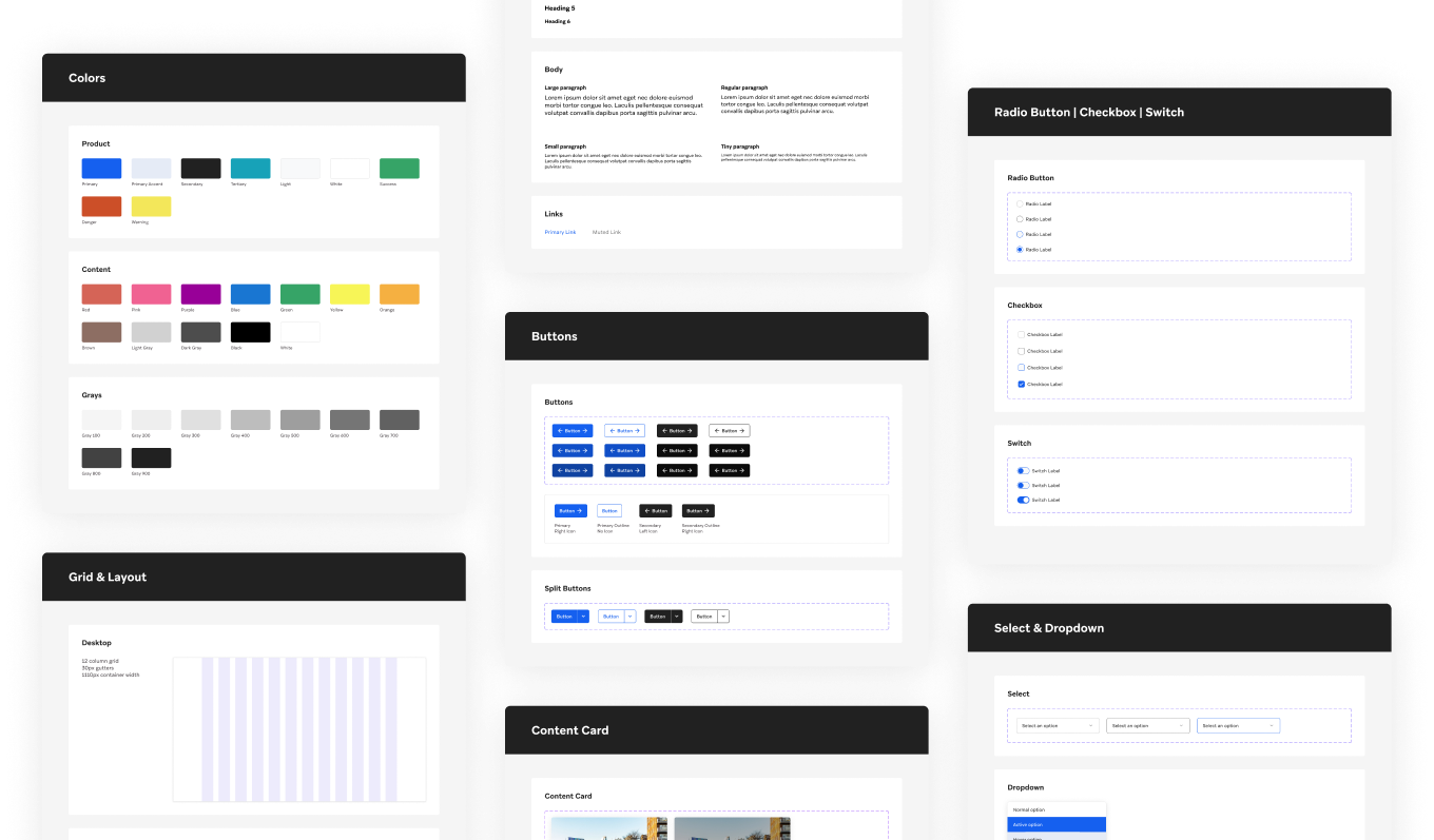
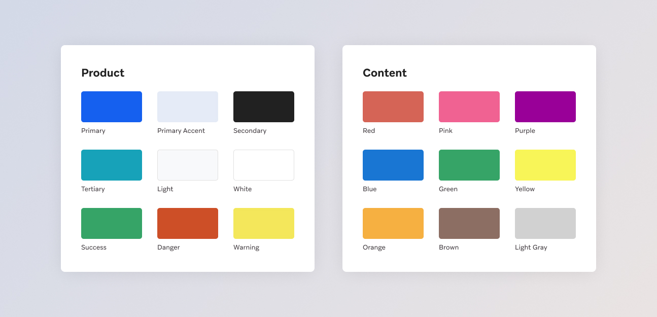
Colors
The Macro color palette consists of Product colors that are used in the interface elements and Content colors that are used for tagging and filtering stock content.
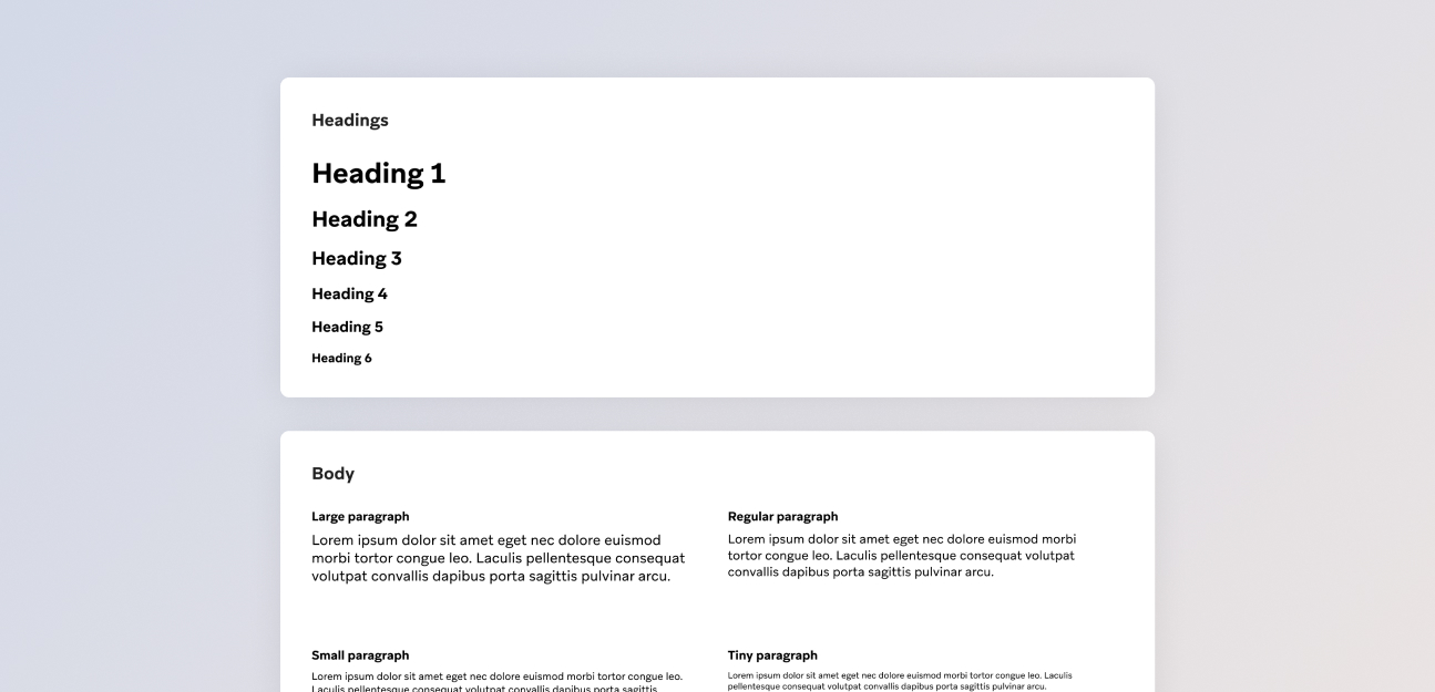
Typography
Styles are defined for headings, different body text sizes, and links.
Components
The Macro Component Library consists of common reusable interface elements and features, such as buttons, cards, text input fields, and select dropdown menus.
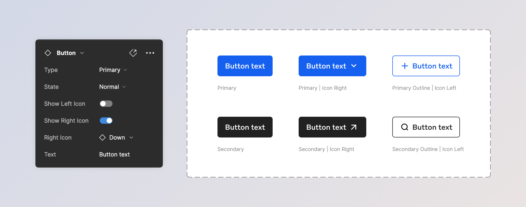
Buttons
The Button component consists of different types and icon positioning variations
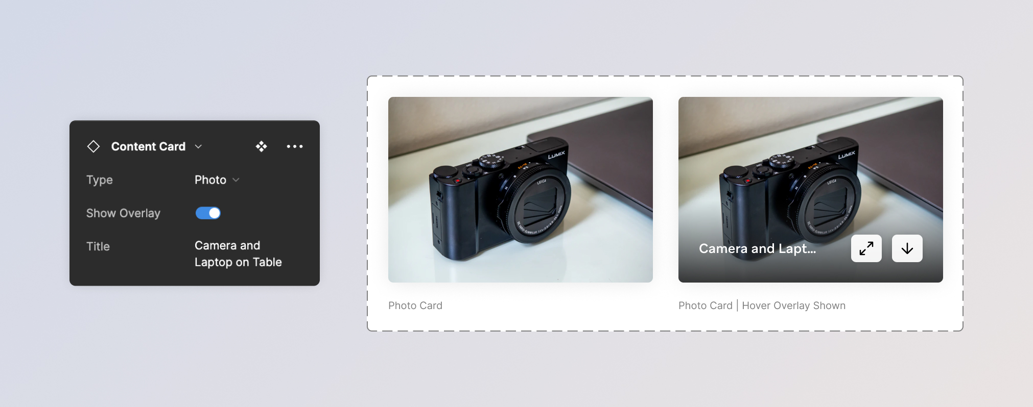
Cards
Cards are used to display FOCA assets such as photos, videos, templates, collections, and categories.
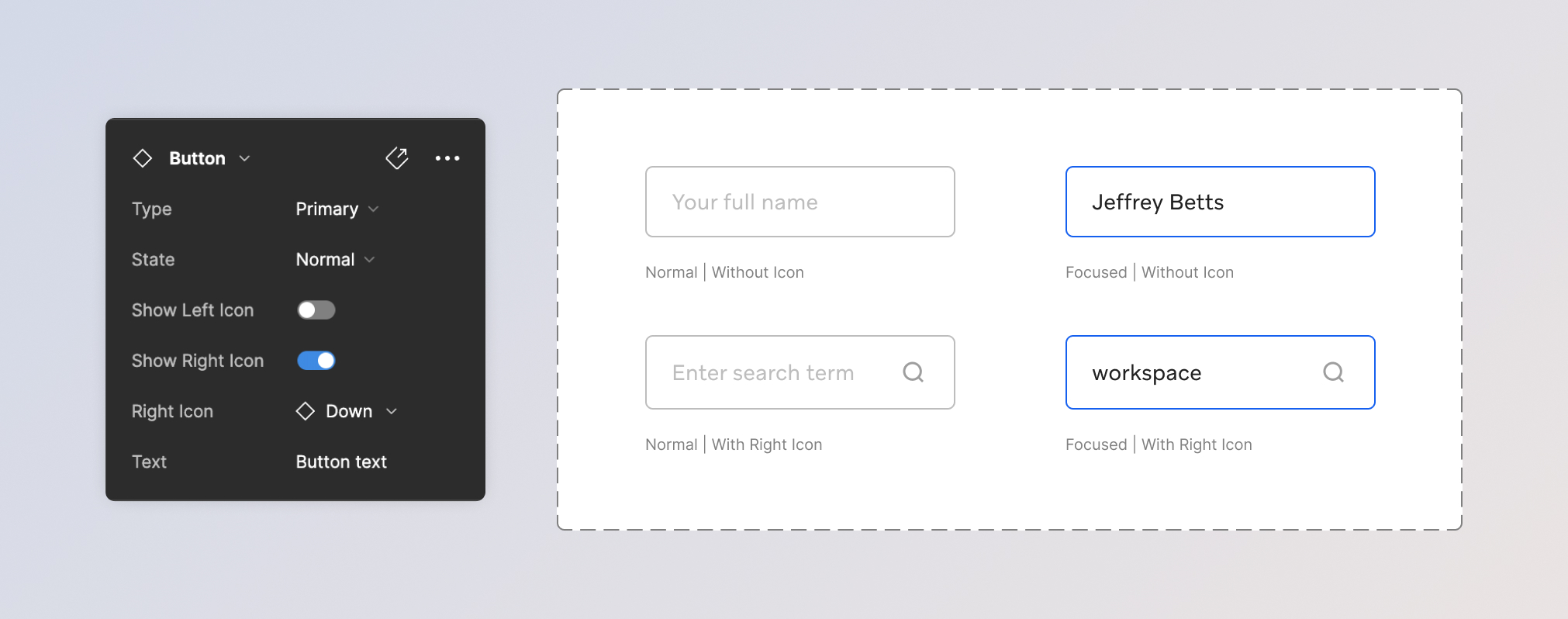
Text Inputs
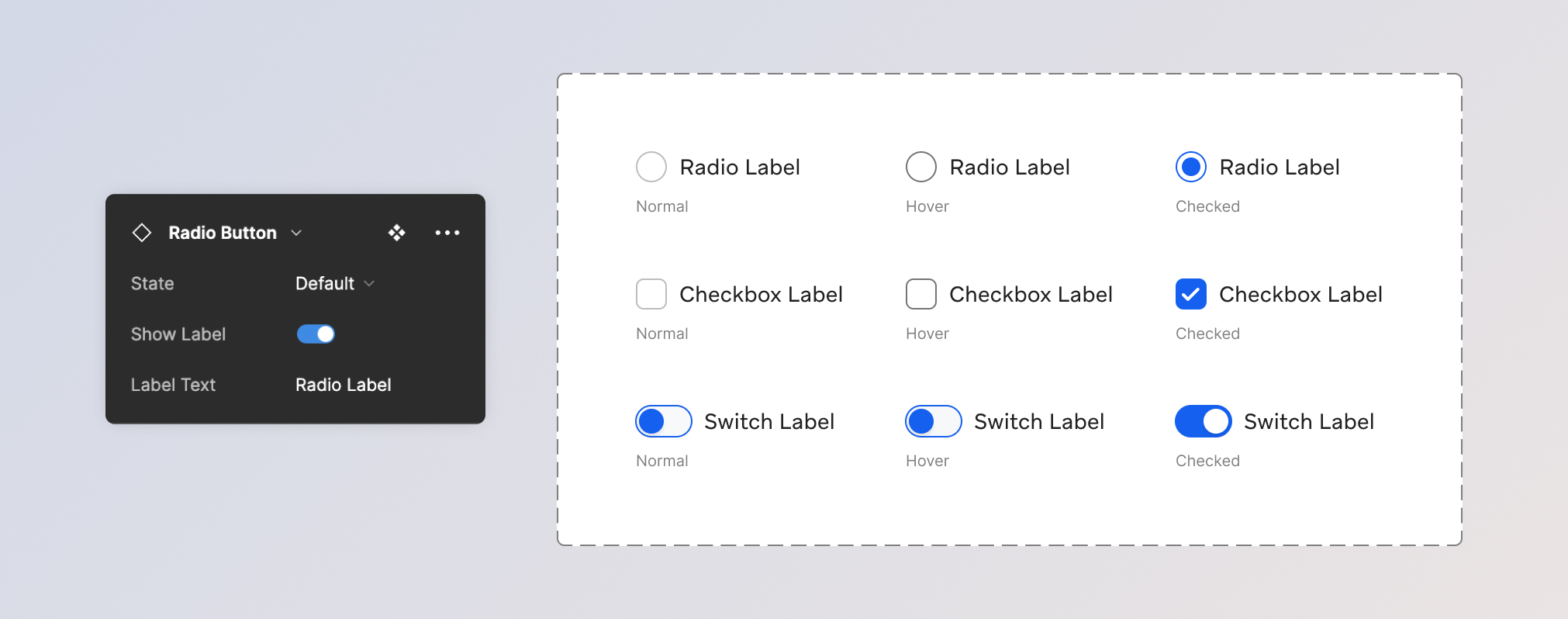
Radio Buttons, Checkboxes, and Switches
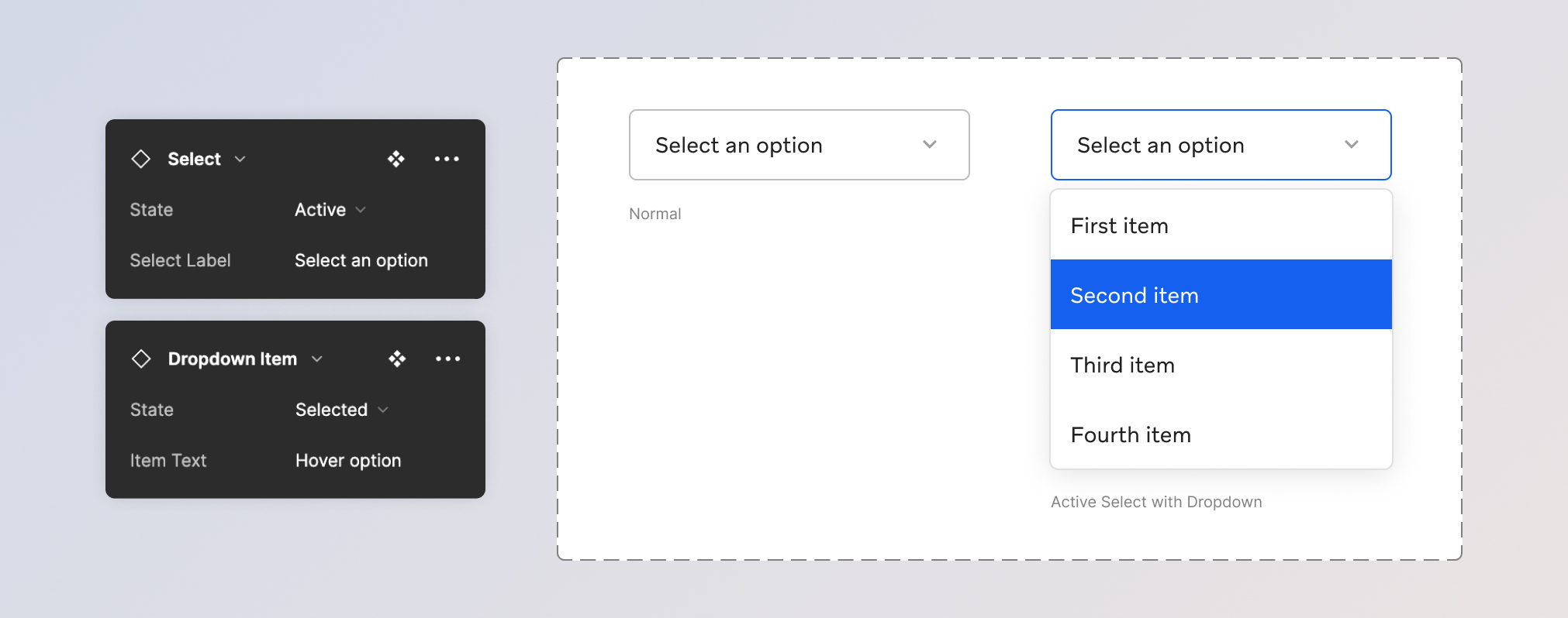
Selects and Dropdowns
In Use Across FOCA
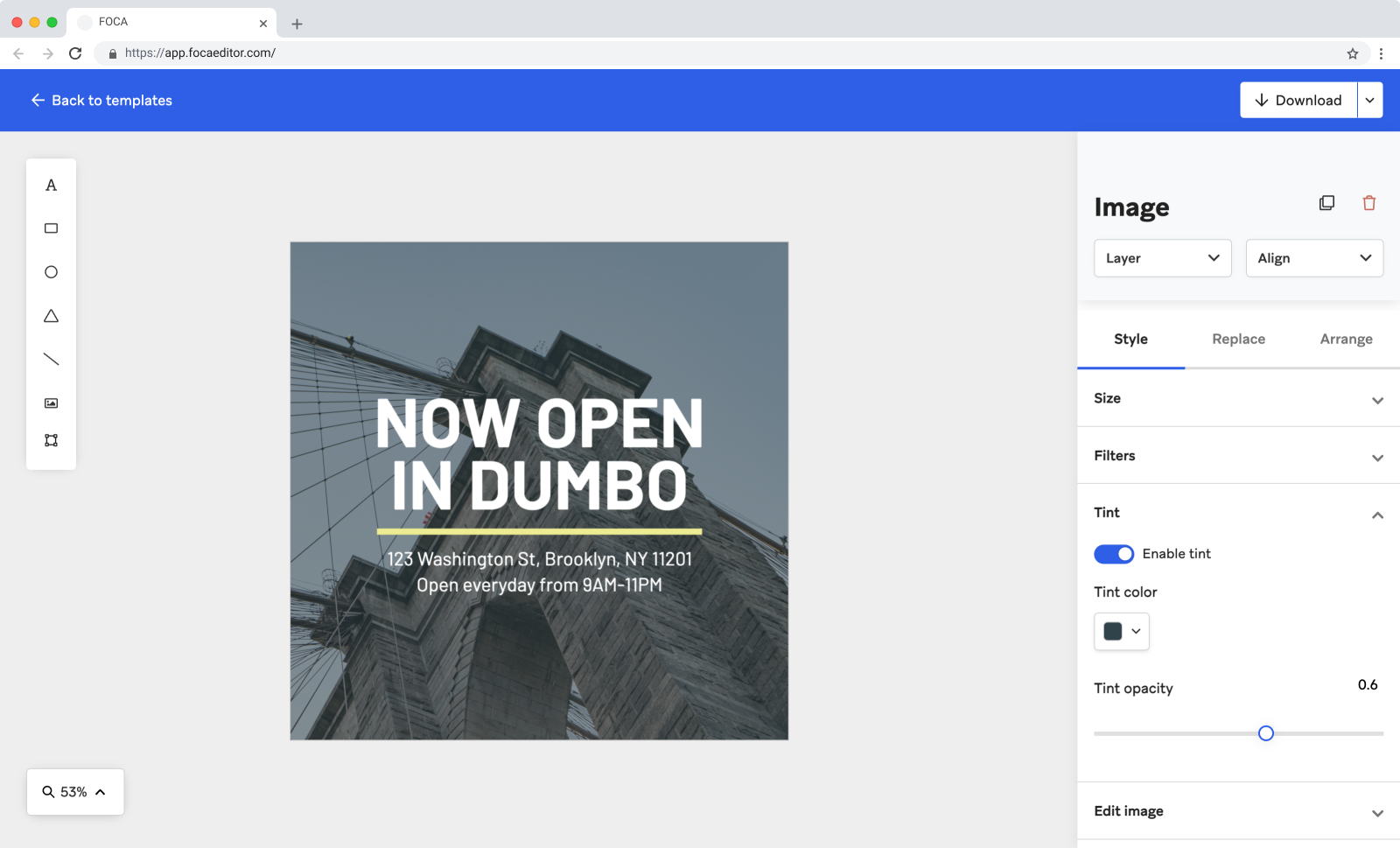
Macro is in use across the FOCA ecosystem of products and tools, including FOCA Editor.